
How To Create An Eye Catching Monochromatic Interior Design
Why design your Sydney home with anything else when you have a favourite hue—even if that colour is black or white? A space adorned in a single colour is indeed visually striking and exceptionally stylish. We understand, variation is important but textural contrasts and subtle intricacies may add individuality and curiosity. Apart from looking elegant, choosing monochromatic colour scheme for your interior design makes catching up with a colour palette significantly easier, making the entire creative process much less hectic.
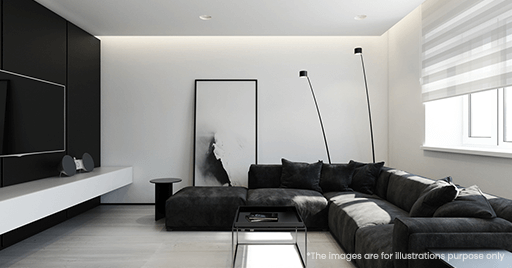
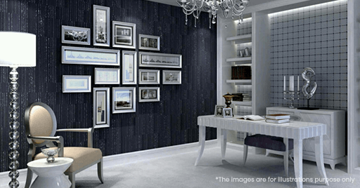
The elegance and grace of a monochrome interior design concept are paramount. The monochromatic style is often confined to the use of a single colour, giving this design style a monotonous or boring impression. While the monochrome home is characterized by a single colour accent, it encompasses much more. It’s about choosing a single base colour and its multiple shades, nuances and tints. The monochromatic style starts with a single hue and the descendants of the colour are used to design the room. The idea of decorating a home with only one colour can be frightening, but the outcome is a classy and stunning look.
It’s no secret that colour has the power to change a space, but deciding on the right palette for your house may be difficult. Everything from the ambience you want to create in your space to the natural light it gets must be taken into account. Then there’s the fear of commitment you want to be able to live with your colour choice for a long time without having any regrets or you can get help from property styling experts.
What is a Monochromatic Colour Scheme?
Monochromatic colour palettes do not only refer to black and white interiors, contrary to common opinion. The word monochrome is derived from two words: mono, which means single, and chrome, which indicates colour or coloured element. So, technically, monochrome interior design combine varying tones of a specific colour.
What is Monochrome Home?
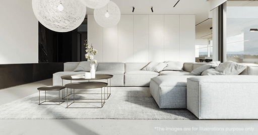
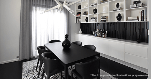
A monochromatic Sydney home is designed with only one colour and various tones of that colour. Everything looks to be immersed in one colour, from the walls to the carpet, from the furnishings to the decor, and the result will captivate your attention. The monochromatic concept can be aesthetically beautiful if done right.
Before you start designing your monochromatic space, you must focus on all aspects. Monochromatic rooms create a sense of cohesion while also making the space appear larger.
How to Pick a Colour for the Monochrome Room?
As monochrome implies “one colour,” it makes sense that colour scheme should be your first focus when designing a monochromatic design . There might be a lot of pressure to select the “perfect” colour because the entire scheme is hinged on it. What is our piece of advice? Choose a colour that you are gravitated to rather than following the trend. You’ll also need to carefully consider the current lighting scenario as well as the overall mood you want to create.
If you’re having problems choosing between a few different colours, start making a few mood boards to evaluate which overall look works best for you!
A monochromatic colour scheme in interior design is the contrary of shy, eye-catching, and bold. Where do you start? When it comes to colour, how much is too much? What can be done to keep a narrow palette from becoming uptight and boring? Our interior ideas on what’s most important to consider when choosing monochromatic will help you design your Sydney home, whether you’re going for subtle or neutral or vibrant decor. Let’s get started!
Starting with Monochromatic Colour
Choose the Colour
The most important element is deciding on a monochromatic colour plan for your home. You can choose a colour that brings you joy if you go with a monochrome home. It’s a widespread myth that the theme’s colours are confined to neutrals, however this isn’t the case. You can choose any colour you want depending on your ideas and impulses. We recommend looking at paint samples and using them as inspiration if you need help narrowing down your options.
Also Read: Expert opinion on picking the right color palette for your home.
Layering Colours
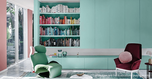
While monochrome interior design often use the same hue and accent, you can vary shades and even contrast with bolder hues as you craft your design.
If you’re not sure what complementary colours to use in a room, look at the colour on your walls and select colours that have the same undertone, even if the hues are different. You may create a space where your colours mix seamlessly and beautifully by sticking to a common undertone.
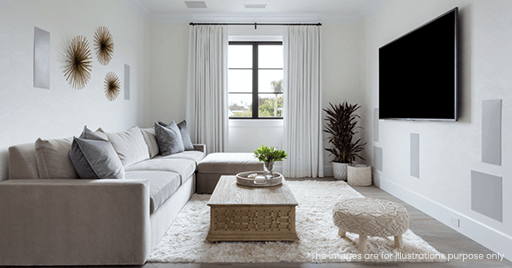
Add Texture
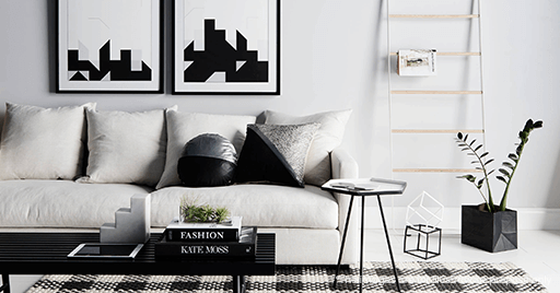
Though one of the perks of a monochrome room is cohesion, there is such a thing as too much of a good thing. If the design elements in your space are too similar to one another, the space may seem monotonous. Using pattern and texture to add visual appeal is a simple way to do so. Make a conscious effort to integrate a variety of various textures as you look for elements to fill the space. Patterns & prints that complement your colour scheme will also assist you in accomplishing that goal.
Must Read: 5 Amazing tips to decorate your home in mixing patterns & prints.
Pop of Vibrance
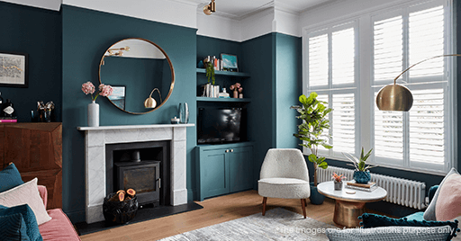
Without being the only colour in the room, a colour can be prominent in your space. Consider using furniture and decor to create reflections of your chosen colour across the space if it is extremely vibrant. Your monochromatic palette should still stand out even if the rest of the room is neutral.
Interested in reading: Enhance your room with neutral colors.
Go for Contrasts
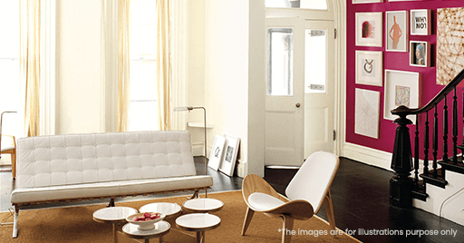
The majority of people want to go for a monochromatic design but are terrified of going overboard with colour. We recommend going for contrasts and layering colours. Contrasts help to reduce the impact of boldness while maintaining the monochromatic impression. The contrast, on the other hand, must be subtle because the purpose of contrast is to bring designs to life. Otherwise, it may become flat.
Must Read: Experts opinion on selecting home color design & mistakes.
Finish with the Accents
Without a finishing accent or piece, no look is complete. Interiors, especially monochrome ones, follow the same rules. After you’ve laid out your overall room with its colours, patterns, and textures, the final accents will help the space feel more complete.
While the most of elements in a monochromatic interior design should reflect the main pattern, accents are allowed to break the norm. Accents that contrast with the monochromatic colour scheme, in fact, can add a layer of visual appeal and help to avoid a monotonous home.
Are you thinking to decorate your Sydney house in a monochromatic style? Monochrome is a popular choice among first-time designers since it is considered one of the easiest home colour schemes to master. You may also make a great impact with only one colour.